Atlas F1 GP Illustrator
Painting is not only about talent, and the creation process is far more complex that it may appear. There are endless rules, and several do's and don't's that escape the eye of the casual viewer. Atlas F1's GP illustrator Bruce Thomson brings you closer to the experience of creating a piece of art
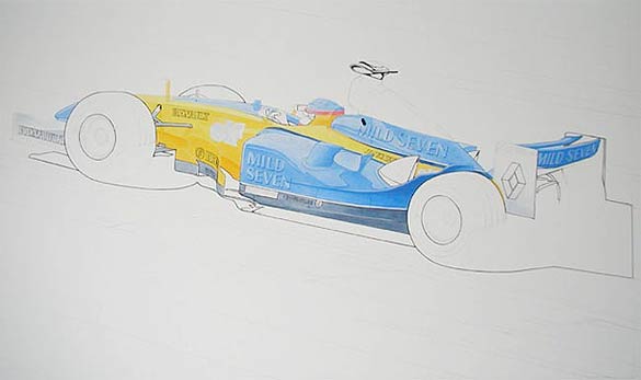
The outline takes a lot of time and patience, as the only effective way to get the line on is by freehanding it. I could put it in with a drafting pen, which would allow me to use templates and curves, but the ink usually fades over time to a sepia tone and I most certainly do not want that happening here. I painted in the outline using a triple zero brush which is very fine and gives a nice even line.
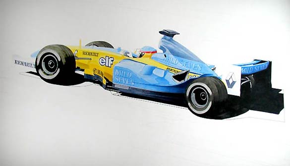
It was a real relief to get the outline over with for the time being and start brushing in colour again. As you can see above, I've added the yellow to the body of the car and dark blue to the base of the sidepod. I haven't highlighted the method by which I did this at all as it is largely the same as how I painted in the sky blue of the body last week. The yellow has probably about eight layers of paint thick and in the shadow area underneath the nose cone I've added a little red and orange to suggest cast shadow. I'll probably end up going back into the shadow area with a very thin coat of black to tone it down a little and make it appear more like cast shadow.
I've also started to throw in some of the tone on the white areas of the car (rear and front wing endplates, primarily). The basis for this is several thin coats of a colour called "twilight"; a name which describes the colour perfectly. Twilight is a good base colour for shadow, but once again, I'll have to go in later and paint over the twilight to tone some of the colour out of it and match the shadows there to the rest of the car. This is one of the things that I really like about painting in this thin, watery fashion, is that it allows you to mix the paint on the board, as it were, rather than mixing it on your palette. The thin coats of paint actually layer each other on the board and alter the colours behind them. It's a little more time-consuming than painting opaquely, as I've probably mentioned, but it does give you a lot more control over colour.
Finally, for this week, I painted in the dark blue on the top of the engine cover, increased the shadow underneath the wing on the side pod and painted in the tyres, logos and camera housing. The dark blue on the engine cover is still in its infancy, only having about three layers of paint so far in it's darkest areas, but I wanted to get it established now so I could see the way the car was shaping up as a whole. What probably took me longest in this portion of the painting was the shadow under the wing on the sidepod. I started by layering it with a thinned mixture of ultramarine blue and Mars black, but it took me probably about 30 coats to get it to the tone I wanted. The reason it took so many coats is that I thinned the paint too much. I didn't want to get it dark too quickly, and perhaps "overpaint" it, so I was a little too cautious and painted it too thinly. It's not a problem, really, as the end result is too my liking, but I could have done it much more quickly if I'd had the courage of my convictions.
The dark blue on the engine cover is similar to that in the "elf" logo, so I brushed those in too. In the case of this logo, I've brushed the colour in opaquely as an outline in order to make it stand out from the yellow as much as it should. Finally, I brushed in large swathes of opaque Mars black cut with cadmium red (I've found that pure Mars black looks unrealistic) in the shadowed areas under the car and the tyres. Having done that, I mixed a thinned bronze yellow with the Mars black again and painted on consecutive transparent layers on the face and the top of the tyres. I add the bronze yellow as tyres are never pure black; they always have a component of some other colour in them, and in this painting the there is a strong "yellow" theme, so I'm making sure that that is picked up in the tyres. For the time being, the actual wheels are painted in a thinned mixture of twilight and black to give them a metallic sheen. I'll probably have to add a wee bit of thinned bronze yellow to them to match them with the tyres. I used the same colour to fill the "Renault" logos, although I've made considerably more coats to the logos in order to darken them up quickly.
And this is the result:
The car is starting to look like it is supposed to now. It is by no means finished, but you can see the painting emerging from the drawing now. There is still quite a bit of work to do, but at this point, I feel like "I'm over the hump" with it. I'll be getting into the background as well as tightening up the car itself next.
I've spent 20 hours on the painting this week, for a total of 50 hours. Twenty to 25 hours should see it close to finished - touch wood!
I've gotten quite a bit done on the painting these past two weeks, in spite of being busy with lots of other stuff. If you recall, when we last left the painting, I'd just started drifting in the colour and was on the verge of beginning to lay in some outline, and indeed, the outline was the first item which I got stuck into. I include the outline because I like the graphic punch that it gives the painting. It's definitely a stylization, as you know from experience that you generally don't see outlines on things in everyday life, but I try to draw the line in subtly and alter the colour where appropriate. For instance, in the picture you see below, I haven't extended the outline to the top of the car (save the camera housing) as a black outline surrounding sky blue or yellow would be far too noticeable and distracting. So, for the time being, the black outline is limited to enclosing those areas on and under the car which are largely black (which includes some of the letterforms in the sponsorship), thus:


|
Contact the Author
Contact the Editor |
Please Contact Us for permission to republish this or any other material from Atlas F1.
|
Volume 10, Issue 13
Atlas F1 Exclusive
Interview with David Richards
Interview with Geoff Willis
Interview with Jenson Button
Interview with Takuma Sato
Articles
Every Other Sunday
The Paint Job: Part IV
Telling Teammates Apart
2004 Bahrain GP Preview
2004 Bahrain GP Preview
Bahrain GP Facts & Stats
Columns
The F1 Trivia Quiz
Bookworm Critique
On the Road
Elsewhere in Racing
The Weekly Grapevine
> Homepage |