
Atlas F1 Assistant Editor
They say a picture is worth a thousand words. Well, what about numbers? The Atlas F1 Charts Center offered a visual representation of the drivers' and teams' performance throughout the 2004 season, and now it's time to see how it was in the last round and beyond
Brazil Charts
Chart I: The following chart shows the actual difference in distance between the pole sitter and the rest of the grid - taking into consideration the circuit's lap length and the best time each driver has set in the first qualifying session. If the pole sitter completes a full lap in the fastest time, then all other drivers will complete less than a full lap in the very same time. The slower they are, the less distance they will be able to complete at the same time as the pole sitter. The difference is therefore displayed in metres. (Note: drivers outside the 107% may be excluded.)
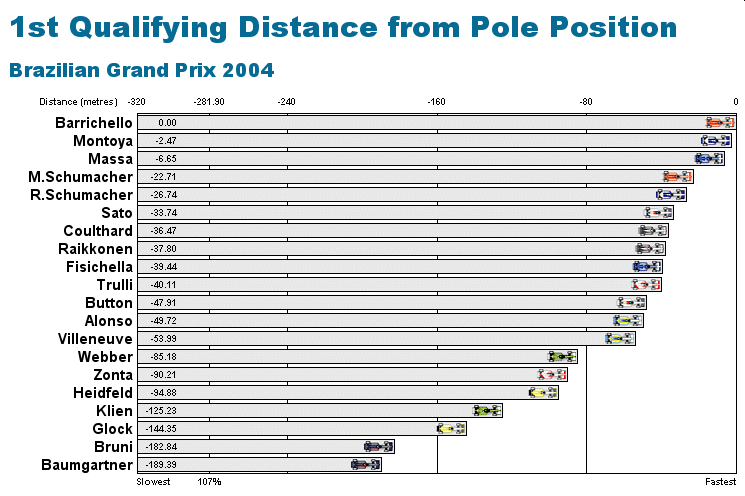
Chart II: The following chart shows the actual difference in distance between the pole sitter and the rest of the grid - taking into consideration the circuit's lap length and the best time each driver has set in the first qualifying session. If the pole sitter completes a full lap in the fastest time, then all other drivers will complete less than a full lap in the very same time. The slower they are, the less distance they will be able to complete at the same time as the pole sitter. The difference is therefore displayed in metres. (Note: drivers outside the 107% may be excluded.)
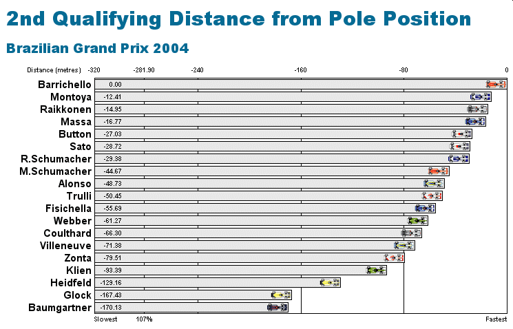
Chart III: The following chart shows how much further the GP winner travelled, in the time needed to take the checkered flag, compared to the other drivers. Drivers that were classified without finishing the GP, are shown with a clash icon, and are included based on their last lap.
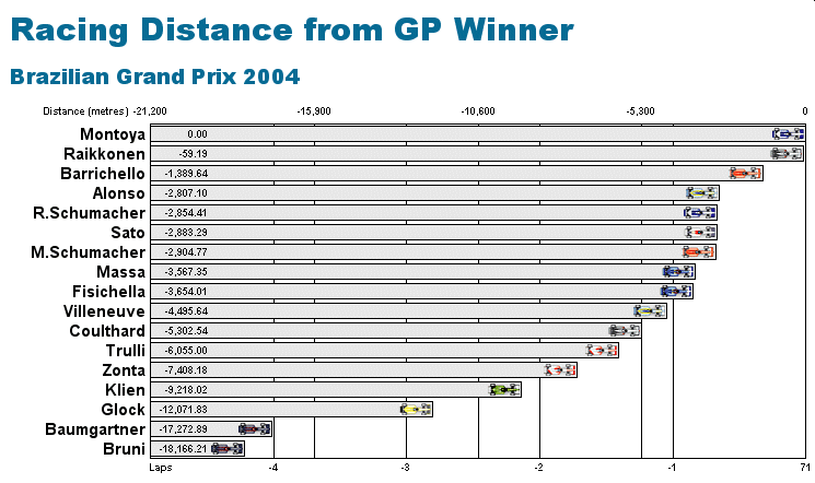
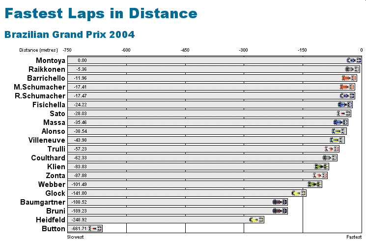
Chart IV: The following chart shows the actual difference in distance between the driver with the fastest lap of the race and the rest of the field - taking into consideration the circuit's lap length and the best lap time each driver has set during the race. If the driver with the fastest lap completes a full lap in the fastest time, then all other drivers will complete less than a full lap in the very same time. The slower they are, the less distance they will be able to complete at the same time as the driver with the fastest lap. The difference is therefore displayed in metres.
2004 Review Charts
Chart I: The following chart shows the actual difference in distance between the pole sitter and the rest of the grid - taking into consideration the sum of the circuits' lap lengths and the best times each driver has set in each first qualifying sessions. Only drivers that set a time in all 18 first qualifying sessions are included. Pole sitter in this case is the driver whose sum of lap times in the season's 18 first qualifying sessions is the lowest, while a full lap is the sum of all the circuits' lap lengths, which amounts to 89,707 metres. If the pole sitter completes a full lap in the fastest time, then all other drivers will complete less than a full lap in the very same time. The slower they are, the less distance they will be able to complete at the same time as the pole sitter. The difference is therefore displayed in metres.
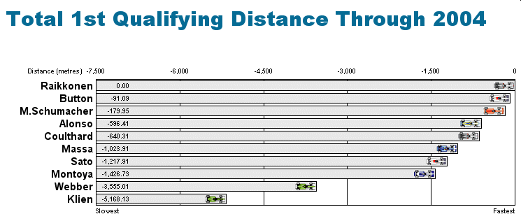
Chart II: The following chart shows the actual difference in distance between the pole sitter and the rest of the grid - taking into consideration the sum of the circuits' lap lengths and the best times each driver has set in each second qualifying sessions. Only drivers that set a time in all 18 second qualifying sessions are included. Pole sitter in this case is the driver whose sum of lap times in the season's 18 second qualifying sessions is the lowest, while a full lap is the sum of all the circuits' lap lengths, which amounts to 89,707 metres. If the pole sitter completes a full lap in the fastest time, then all other drivers will complete less than a full lap in the very same time. The slower they are, the less distance they will be able to complete at the same time as the pole sitter. The difference is therefore displayed in metres.

Chart III: The following chart shows the number of retirements experienced by teams and drivers throughtout the season. Cars that retired but were classified are counted as retirements, as well as dummy grid retirements.
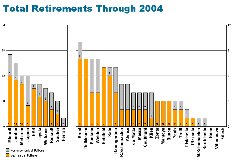
Chart IV: The following chart shows the average position in the first qualifying session for each driver this season.
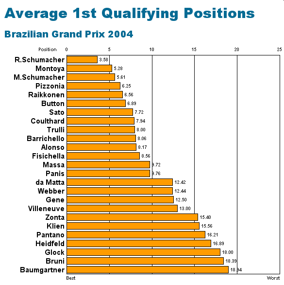
Chart V: The following chart shows the average position in the second qualifying session for each driver this season.
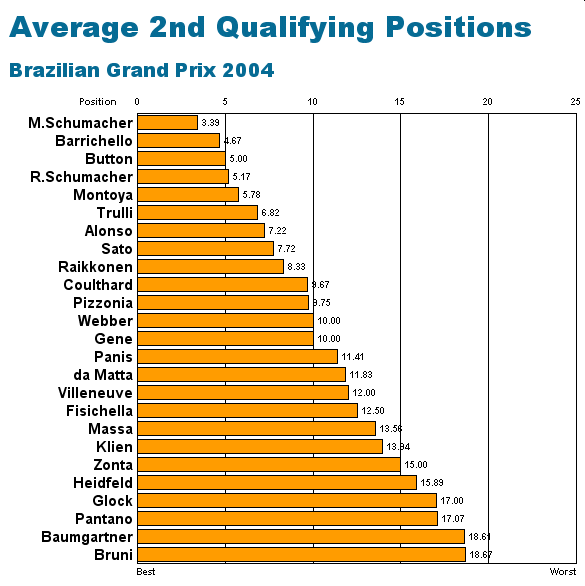
Chart VI: The following chart shows the average position in both qualifying sessions combined for each driver this season. In case of a tie, the driver with the highest average in the 2nd qualifying session is ranked first.
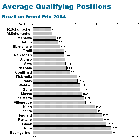
Chart VII: The following chart shows the average finishing position for each driver this season. The finishing positions for drivers not classified in a race are arranged based on the number of laps they completed and the time it took to complete them.
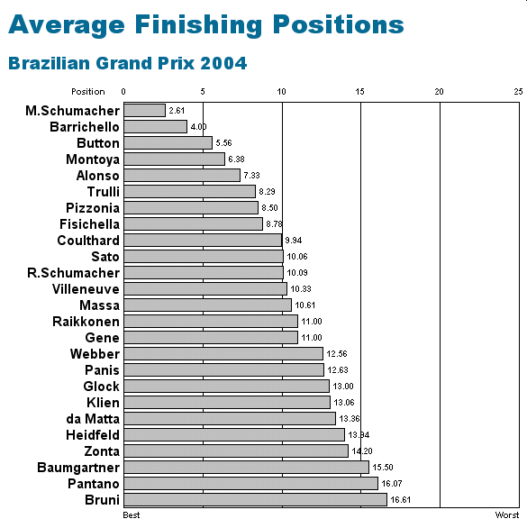
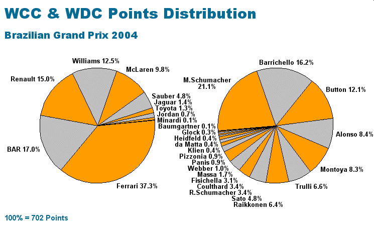
Chart VIII: The following chart shows how the World Championship points are distributed among the drivers and the teams this season.
|
Contact the Author Contact the Editor |
Please Contact Us for permission to republish this or any other material from Atlas F1.